How to Use Infographics to Communicate Complex Ideas
Turning Data into Art: A Complete Guide to Creating Impactful Infographics and Communicating Complex Ideas Visually
Published At: 05/17/2023
Communicating complex ideas can be a challenge for marketing professionals and content creators.
Often, it is difficult to explain complex concepts in a clear and easy-to-understand way for the target audience. This is where the use of infographics comes in.
Infographics are pictures that help to show information in a simple and nice way. They make it possible to communicate complex ideas in a short and interesting way.
In this post, we will talk about why it's important to use infographics to communicate complicated ideas and show you how to make good ones that can help you improve your brand communication.
What are infographics?
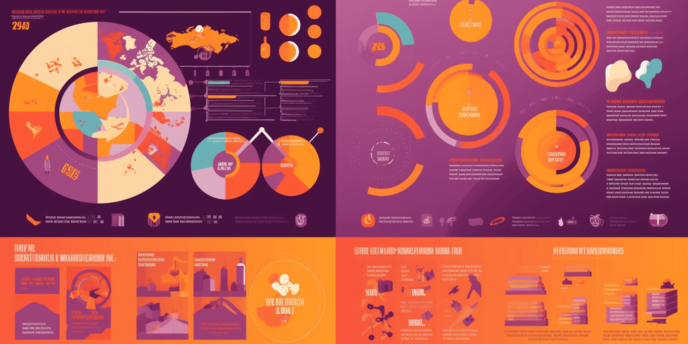
Infographics are pictures that show information or data in a simple way. Images, graphics, text, and other visual elements are used to share a message or tell a story.
They can be used to represent a variety of information, from numerical data and statistics to processes and flows of information.
Infographics are useful for presenting information in a visual and attractive way because they use visual elements to simplify and condense complex information, making it easier to understand and assimilate.
They also help to grab the attention of the target audience and make the message more memorable and impactful.
Also, infographics can be easily shared on social media, websites, and other platforms, making them an effective content marketing tool to reach a wider audience.
Advantages of using infographics
The main advantages of using infographics include:
• Clear communication of complex information: infographics effectively represent complex data and information in a clear and easy-to-understand manner.
They can simplify complex concepts, present statistics, and visualize processes in a more accessible way.
• Attraction of audience attention: their visual nature makes them more appealing to the target audience, increasing the chances that the message will be read and understood.
Additionally, well-designed infographics can help retain audience attention for longer.
• Ease of sharing: infographics are easily shareable on social media, blogs, and other online platforms.
This can help increase brand visibility, generate more traffic to the website, and expand the reach of the message.
• Increased content value: using them can make content more attractive and valuable to the target audience.
Additionally, sharing infographics can increase the brand's authority in a particular industry.
• Personalization of content: it can be customized to fit the brand's visual identity, making visual communication more consistent and impactful.
To sum up, infographics are a strong way to make complicated ideas easy to understand using pictures and to make them look nice. They also help people engage more with the information you are sharing.
How to create an effective infographic?
To create an effective infographic, it's important to follow a few steps:
Define the message objective: before making the infographic, it's important to know what you want to say and who you're saying it to.
This will help you decide what information is important to share and what pictures or other visual things will be best to help people understand what you're saying.
Choose the most important information: after defining the message and target audience, it's necessary to select the most important information that will compose the infographic. It's crucial to avoid irrelevant or overly complex information.
Select the best sources and statistics: it's important to choose reliable sources and relevant statistics for the information that will be presented in the infographic. It's essential to check the accuracy of the information before using it.
Define the infographic structure: it's necessary to define the its structure that is, how the information will be visually organized.
It's important to choose an attractive and easy-to-understand layout that leads the reader's eye in a logical way.
Choose the most appropriate colors and visual elements: Picking the right colors and pictures is very important to make the infographic look nice and have a big impact.
Choosing colors that go well together and pictures that match the information you're sharing is important.
Create the infographic: Once you've picked the information, sources, and numbers you want to use, and you've decided on the structure and colors and pictures you want to use, it's time to actually make the infographic.
There are lots of tools online you can use to create infographics, like software you can download or websites you can use.
Review and test the infographic: once you've made the infographic, it's important to check it over carefully to make sure there are no mistakes or wrong information.
You also need to try it out on different devices and screen sizes to make sure it looks good and is easy to read on different websites or apps.
With these steps in mind, it's possible to create an effective infographic that conveys complex information in a clear and appealing way.
Examples of successful infographics
There are several examples of successful infographics that have been able to communicate complex ideas in a clear and engaging way. Below are a few examples:
"The Periodic Table of Elements" - This is a classic example of a highly famous and useful infographic. The periodic table is a visual representation of known chemical elements, organized according to their properties and atomic structure.
It provides important information about the elements, such as their symbols, atomic numbers, atomic masses, and electronic configurations. The periodic table is widely used in chemistry, physics, and other scientific disciplines, serving as an essential reference for students and professionals.

"The Internet of Things Infographic" - Created by the international consultancy Beecham Research, presents information about the Internet of Things (IoT) in a clear and concise manner.
The infographic uses a hierarchical visual structure that helps organize the information and make it more accessible to the target audience.

"The World Map" (Mapa-Múndi) - Another iconic example of an infographic is the world map. It offers a visual representation of continents, countries, oceans, and other geographical features of our planet.
The world map is used for various purposes, from geographical education to navigation and travel planning. There are several versions and styles of world maps, each with its own peculiarities and additional information, such as political divisions, climates, time zones, and more.

"The Periodic Table of SEO Success Factors" - Created by the online marketing company called Search Engine Land which does marketing online, shows details about the things that affect how well SEO (search engine optimization) works.
The picture is organized and easy to understand. It looks like a table you might find in chemistry class, which makes the information more interesting and easier to remember.

These examples show how infographics can help explain hard ideas in a simple and interesting way. They make it easier for people to understand subjects that might be confusing if explained in a regular way.
Tips for Creating Effective Infographics
Certain tips are important for creating effective infographics that help communicate ideas in a clear and engaging way. Some of these tips include:
Define a relevant and interesting theme: choose a theme that is relevant to your target audience and can be presented in an interesting and engaging way. Think about how you can communicate information clearly and visually attractively.
Select the most important information: infographics should convey information clearly and concisely. Therefore, select only the most important information and avoid including excess data and irrelevant details.
Maintain visual consistency: use a consistent color palette, a legible font, and a coherent visual style so that the infographic has a cohesive and attractive appearance. This helps ensure that the information is conveyed clearly and organized.
Use high-quality graphics and images: use high-quality graphics and images so that the information is conveyed clearly and impactfully.
Ensure that the images used are relevant and consistent with the theme of the infographic.
Test and revise: test with a group of people and revise the infographic based on feedback received. This helps ensure that the infographic is effective and that the information is communicated clearly and objectively.
By following these tips, it is possible to create effective infographics that help communicate complex ideas in a clear and engaging way to the target audience.
Let's see a rhyme about the theme:
I love infographics, oh so clear
Information presented, nothing to fear
Colors and images, all so bright
Making complex ideas, easy in sight
Final Thoughts
In summary, infographics are a powerful tool for communicating complex ideas in a clear, quick, and attractive manner.
They allow data to be visually organized, making information easier to understand and remember. In addition, they help to capture the audience's attention and increase engagement with the content.
To create effective infographics, it is important to follow certain steps, such as defining the message's goal, selecting the most important information, defining the infographic's structure, and choosing the most appropriate colors and visual elements.
It is also crucial to use reliable sources and high-quality graphics to convey credibility to the readers.
Finally, I encourage readers to consider the use of infographics in their own content marketing strategies.
With creativity and proper planning, infographics can be an excellent way to reach and engage with the target audience.