The Psychology of Colors in Marketing: How Colors Influence Consumer Decisions
Unveiling the Power of Colors: How to Use Color Psychology to Create Emotional Connections and Boost Your Business Success
Published At: 05/25/2023
Colors have a powerful impact on our emotions, perceptions, and behaviors. When it comes to marketing, using colors strategically can make people feel certain ways and affect what they buy.
Knowing how colors affect people's feelings is important for making ads that work and connecting with the people you want to reach.
In this post, we will explore the fascinating relationship between colors and marketing. We will discover how colors can convey subtle messages, evoke specific feelings, and strengthen a brand's identity.
Furthermore, we will see how understanding the impact of colors can help you create more effective strategies, achieve higher engagement, and drive consumer decisions.
As we delve into the world of color psychology, you will discover that color choices are not arbitrary but grounded in research and studies on human behavior.
Get ready to explore the captivating universe of colors and learn how to harness their full potential in your marketing.
The Importance of Color Choice in Marketing Strategy
Now that we know colors are important in marketing, it's crucial to understand how picking the right colors for your plan matters.
Each color sends out different messages and feelings, so it's important to match these choices with your brand goals and the people you want to reach.
1 Meanings and Associations of Colors
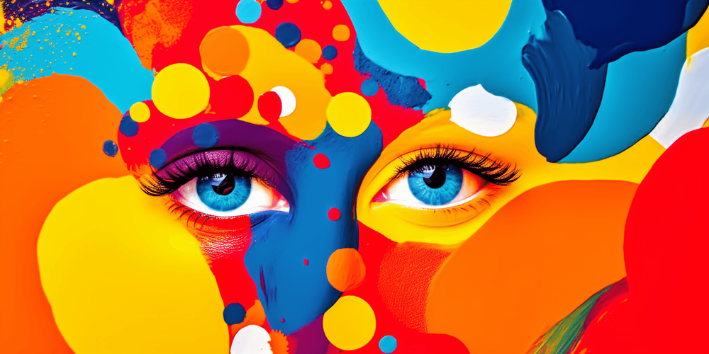
Before deciding which colors to use, it is critical to understand the commonly attributed meanings and associations of each color. Let's explore some of the most used colors in marketing and their psychological implications:
1.1 Red: Red is a color that evokes energy, passion, and urgency. It is often associated with excitement and stimulation, used to create a sense of urgency in promotions and calls to action.
1.2 Blue: Blue conveys calmness, trust, and security. It is widely used by brands aiming to communicate professionalism and stability. Additionally, lighter shades of blue can suggest tranquility and relaxation.
1.3 Yellow: Yellow is a color that represents optimism, joy, and creativity. It is often used to grab attention and convey a sense of fun and enthusiasm. However, it is important to use it in moderation as excessive yellow can cause visual fatigue.
1.4 Green: Green is associated with nature, health, growth, and renewal. It is frequently used by brands aiming to convey sustainability and well-being values. Moreover, darker shades of green can be related to wealth and financial stability.
1.5 Orange: Orange combines the energy of red with the optimism of yellow. It is often used to convey enthusiasm, creativity, and joy. It is a color that grabs attention and can be particularly effective in call-to-action buttons."
When picking colors for your marketing plan, think about the feelings and emotions you want to create in the people you're targeting.
Also, remember that cultural and personal connections can affect how colors are understood, so it's important to know your audience and adjust your choices accordingly.
Let's see a rhyme on the topic:
Colors in marketing are pure magic,
Influencing minds, bringing joy, not tragic.
Each choice holds meaning, it's true,
In the world of brands, results accrue.
On our blog, you'll find,
Tips and secrets, one of a kind.
The psychology of colors, a delightful art,
Transforming your strategy, playing a part.
Check it out now, don't miss the chance,
To explore colors with elegance, enhance.
At https://themindeffect.com/,
Access and discover, without delay, commence!
The influence of colors in branding
In the world of marketing, colors play a crucial role in creating a brand's identity and personality. The careful choice of colors can convey subtle messages and help establish an emotional connection with consumers. Let's explore how colors are strategically used in branding:
Colors are used to create brand identity and differentiation. By selecting the right colors, a company can stand out from the competition and create a unique visual identity.
For example, Coca-Cola uses red as its primary color, making it easily recognizable and globally associated with the brand.
Furthermore, colors can communicate a brand's values and personality. For instance, a brand aiming to be seen as modern and innovative may opt for vibrant and bold colors, while a brand seeking to convey elegance and sophistication may choose more neutral and subtle tones.
Another important aspect is the association of colors with specific sectors or industries. For instance, green is commonly used in brands related to sustainability and the environment, while shades of blue are predominant in brands associated with technology and the financial sector.
By observing some well-known brands, we can see how colors play a crucial role in their branding. McDonald's, for example, uses red and yellow in their visual identity, colors that are associated with energy, fun, and hunger.
On the other hand, the Lindt chocolate brand incorporates gold and brown, colors that convey sophistication and indulgence.
These are just a few examples of how colors are strategically used in branding. Choosing the right colors can make your brand stand out, get the attention of the right people, and say what you want it to say.
When you're deciding which colors to use for your brand, think about what your brand believes in, who you want to reach, and the situation you're in.
The impact of colors on purchasing decisions
Colors have the power to significantly influence consumers' purchasing decisions.
Studies and research consistently demonstrate how colors can affect consumer behavior and their perception of value, trust, and preference towards products or services. Let's explore this impact:
Studies have shown that colors can evoke emotions and create specific associations in consumers' minds. For example, red is associated with energy, passion, and urgency, while blue conveys a sense of trust, tranquility, and security.
These emotional associations can influence how consumers perceive a product or service and, consequently, their purchasing decision.
In addition to emotions, colors can also affect the perception of value. Studies show that people link certain colors with different levels of quality, importance, and cost.
For example, using colors like black, silver, and gold can make something seem fancy and classy, which makes people think it's worth more.
Trust is another important dimension influenced by colors. Colors like blue and green are usually connected to trustworthiness and the natural world.
This can make people feel safe and believe in something more. However, colors like red can create a sense of hurry and make people want to act quickly. But they can also seem forceful or risky, depending on the situation.
Studies show that individuals have personal preferences for certain colors, and this can impact their purchasing decisions.
For example, some consumers may be attracted to bright and vibrant colors, while others may prefer softer and neutral tones. Understanding the target audience and their color preferences can be a significant advantage in marketing strategy.
It is important to note that the impact of colors can vary depending on cultural context, industry, and target audience. It is essential to conduct research and testing to understand how specific colors affect consumer behavior in your sector.
When companies know how colors affect what people buy, they can use that information on things like pictures, product packages, store layouts, and ads.
Picking the right colors can grab people's attention, make them feel connected, and make them more likely to buy things.
Strategies for Applying Colors in Marketing
Choosing the right colors in your marketing campaigns can make a difference in the impact and emotional connection with your target audience. Here are some tips and guidelines to help you apply colors effectively:
Know your target audience: It's really important to know what your target audience likes and what makes them unique.
Find out which colors they like, think about their cultures and what they care about, and then choose colors that match.
Consider the meaning of colors: Remember that each color has symbolic and emotional meanings.
For example, green can be associated with nature and well-being, while yellow can convey optimism and energy. Select colors that correspond to the message you aim to communicate.
Create harmony and contrast: When combining colors, strive for harmony and contrast.
Complementary colors can create an interesting visual impact, while soft and analogous tones can convey a sense of tranquility. Play with different combinations to achieve the desired effect.
Consider the context and industry: Colors can mean different things depending on the situation and the industry. For instance, red can show energy and excitement in fashion ads, but it might not be right for financial service ads.
In those cases, blue can mean trust and reliability. Analyze the message you want to convey and choose colors that align with the context and industry.
Test and evaluate: Conduct tests to see how colors are perceived by your target audience.
Conduct surveys, gather feedback, and analyze performance metrics to understand the impact of colors in your campaigns. Adjust and refine as necessary.
Be consistent: Maintain consistency in the colors used in your brand and marketing campaigns. This helps create a strong and recognizable visual identity, making it easier for the audience to associate with your brand.
Keep in mind that colors are really strong in marketing, but you have to use them carefully along with other design strategies.
When you use colors the right way, you can make a special brand, get people to notice you, and make your marketing messages more powerful.
Case Studies and Practical Examples
Let's explore some case studies and examples of brands or companies that successfully utilize color psychology in their marketing strategies:
● Coca-Cola: The Coca-Cola brand is known for its use of red in its visual identity. Red is a vibrant color that evokes emotions of energy, happiness, and passion.
This color choice contributes to Coca-Cola's association with moments of celebration and joy.
● McDonald's: McDonald's uses red and yellow in its visual identity. Red stimulates appetite and emotion, while yellow is associated with feelings of happiness and optimism.
These colors are strategically applied to grab attention and evoke desire for fast food among consumers.
● Nike: Nike primarily uses black and white in its visual identity. Black conveys sophistication, elegance, and power, while white represents simplicity and purity.
These combined colors create a brand image that conveys confidence, quality, and athletic performance.
● Starbucks: Starbucks adopts a color palette that includes green. Green is associated with nature, health, and sustainability.
This color choice reflects the company's commitment to quality products and ethical business practices, as well as creating a welcoming and relaxing atmosphere in its stores.
● Facebook: Blue is the dominant color in Facebook's visual identity. Blue conveys trust, security, and tranquility.
This color choice helps create a sense of trust among platform users, conveying the idea that Facebook is a safe environment for sharing information and interacting with others.
These are just a few examples of how colors are strategically used in marketing. Each of these brands carefully chose their color palettes based on their brand objectives and target audience.
When we look at these real-life examples, we can learn important things about using color to make people think better of a brand and feel more connected to it.
Remember, every company is different, so it's important to change color strategies to fit your own goals and brand. Take a look at these examples and come up with ways to use color in your own plans to get great results.
Final Thoughts
Throughout this post, we have explored the fascinating field of color psychology in marketing and how colors can influence consumer decisions. To recap the key points discussed:
We studied what each color means and how it makes people feel. We also saw how colors are used to make brands unique and show their personality.
Research showed that colors affect how people behave, like what they think something is worth or if they trust it.
We learned ways to use colors in marketing and looked at examples of brands that did it well. We saw how their choices matched what they wanted and who they wanted to reach.
We talked a lot about how important it is to think about color in marketing. It really matters what people decide to buy.
When you understand what colors mean, change how you show your brand, and use colors on purpose, you can make people feel a strong connection to what you're selling and make them think good things about it.
However, we know that creating quality content can be a time-consuming process that requires significant resources. That's where our specialized content writing agency comes in.
With years of experience in producing engaging and relevant content, our team of writers can help you create a customized editorial calendar for your blog and produce high-quality content that attracts, informs, and engages your readers. Contact us to learn more about how we can help improve your content strategy.
We appreciate you following this post on color psychology in marketing. We hope the shared information has been useful and inspiring to you.
If you have any questions or would like to discuss the topic further, please don't hesitate to reach out to us. We're here to help!